David Bowie Is – AR Exhibition
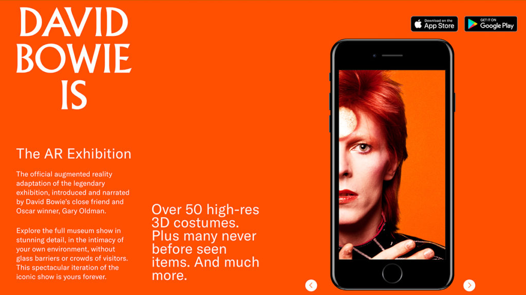
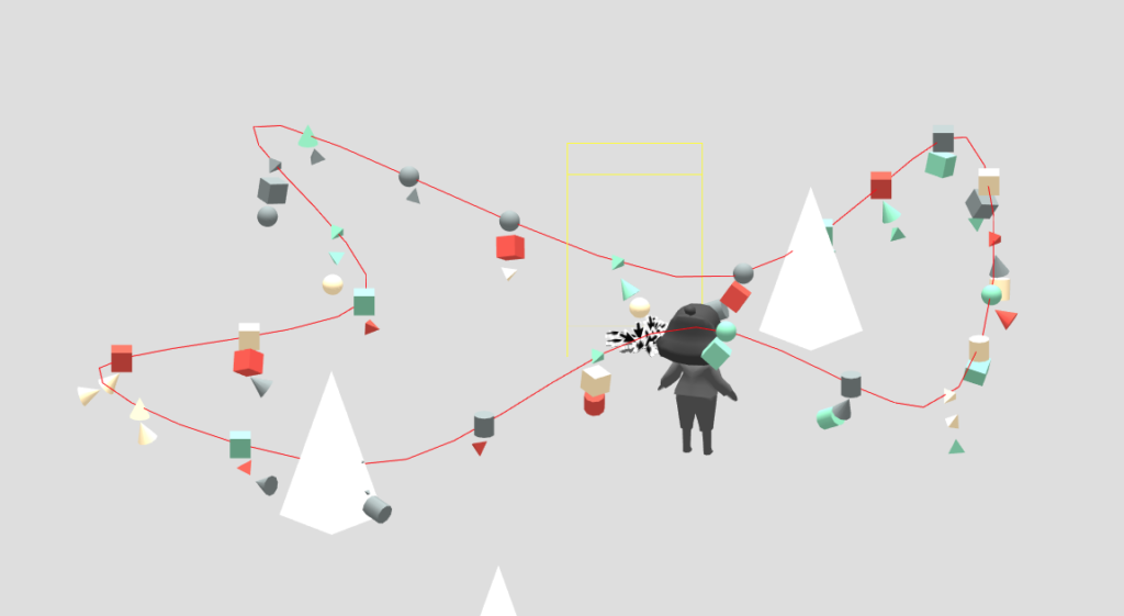
David Bowie Is – AR Exhibition, is an AR project by The David Bowie Archive, Sony Music Entertainment (Japan) Inc. and Planeta. In this post, I jotted down some of my development as Lead Developer, under Director Nick Dangerfield, Art Direction Seth Tillett, and Tech Director Dan Brewster.
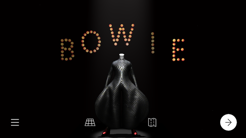
Paper Interaction

The irl exhibition has a lot of 2D materials, and for browsing them in a mobile app, there is a subtle balance we want to maintain, a balance between efficiency and AR-ness. We tried several ways, shuffle, fade in/out, but ultimately it feels the most natural to see them laying or leaning on some sort of surface.
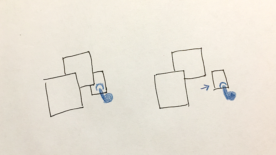
And just like how you would expect and do in real life, we made the 2D materials move with your fingertip.

The effect especially works great on small paper cutout.
(Note – all videos in the post are direct screen recordings on my old iPhone6s)

And as a tabletop AR, some 2D artifacts need to be stacked in order for all to fit in, thus we need to a way to shuffle them.
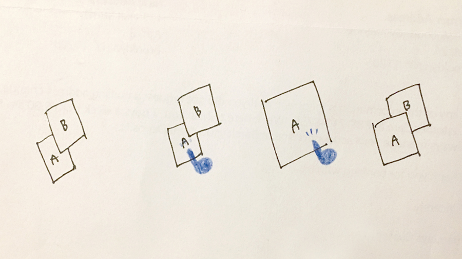
After testing, we found out that, bringing the “focus” artifact to the front of the stack after being sent back, feels the most natural and intuitive.

Paper stack shuffle.

Scene Changes Mask

To pack the whole physical show into a tabletop AR mobile app, it is important to find a way to navigate the rich contents.

It includes over 400 high resolution captures of David Bowie’s costumes, sketches, handwritten lyrics, notes, music videos and original works of art are presented in striking arrangements and immersive settings, as well as dozens of never before seen items, including archival videos, drawings, photographs, and notes.
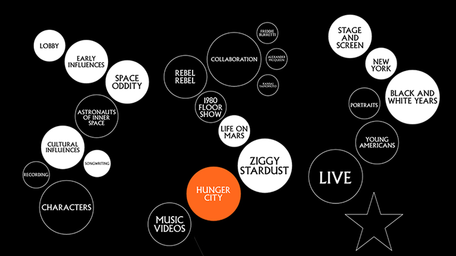
davidbowieisreal.com

Within the show, we decided to condense each section into a digestible Diorama, and make them navigable through a map.

And within each diorama, we need to make some sub-scene changes as well to accommodate all the contents.
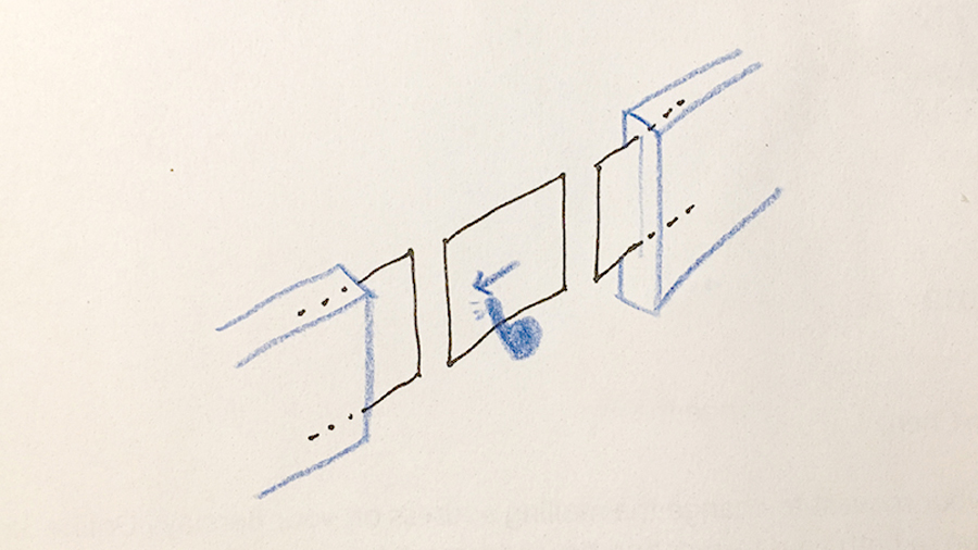
For this, I used a lot of invisible 3D mask.

The mask uses depth buffer to occlude and prevent the contents from being shown. It is a simple but effective graphic trick, and more can be found here.

For example in Hunger City, two masks are places on the sides of the stage, to hide the off-stage contents.

Scene Making

Under the guidance of Director and Art Director and with feedback from the whole development team, I build the AR scenes including: Early Influences, Space Oddity, Cultural Influences, Songwriting, Recording, Characters, Collaborations, Life On Mars, Ziggy Stardust, Hunger City, Stage and Screen, New York, and Black & White Years. Below are the in-app screen recording of some of those scenes.

Early Influences

Hunger City

Black and White Years

Stage and Screen

New York

Ziggy Stardust

Lost and to Find

Slowly starting working on a personal project “Lost and to Find”, it’s a point & click browser based exploration with chapters of Lazy, Same, Jealous, Unconfident, No Likes, and Can’t See. ( i know! it’s so cheesy ;) )

Just wrapped up a mvp version of Chapter Same ↓

I will post updates here: https://jhclaura.tumblr.com/. Okay back to work!

Reminder: Maya => Blender => Three.js

AHHH why is it so difficult to export rigged model to Three.js?

This is a reminder post of how did I export with correct joint rotations.


[From Maya] – export selection as FBX, set Up Axis from Y to Z


[Import to Blender] – Scale up!


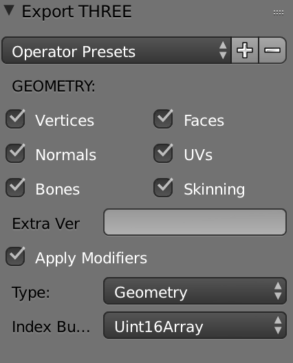
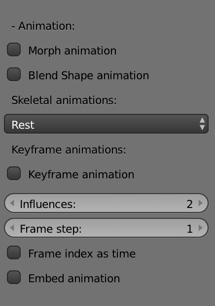
[Export to Three.js] – Select Mesh and export as Three.js. Geometry: also select “Bones” and “Skinning”. Type: choose “Geometry” instead of BufferGeometry. Skeletal animations: select “Rest” instead of “Pose”


[Import to Three.js] – Load with THREE.JSONLoader. Set “skinning: true” in material. Create with THREE.SkinnedMesh. And finally manipulate with THREE.SkinnedMesh’s skeleton.bones array.


Geez.

[Stupid_Hackathon] Peep Rack / Intestine AR

(Update 3/1) It’s my honor to give Peep Rack a new name Intestine AR, granted by Stupid Hackathon.

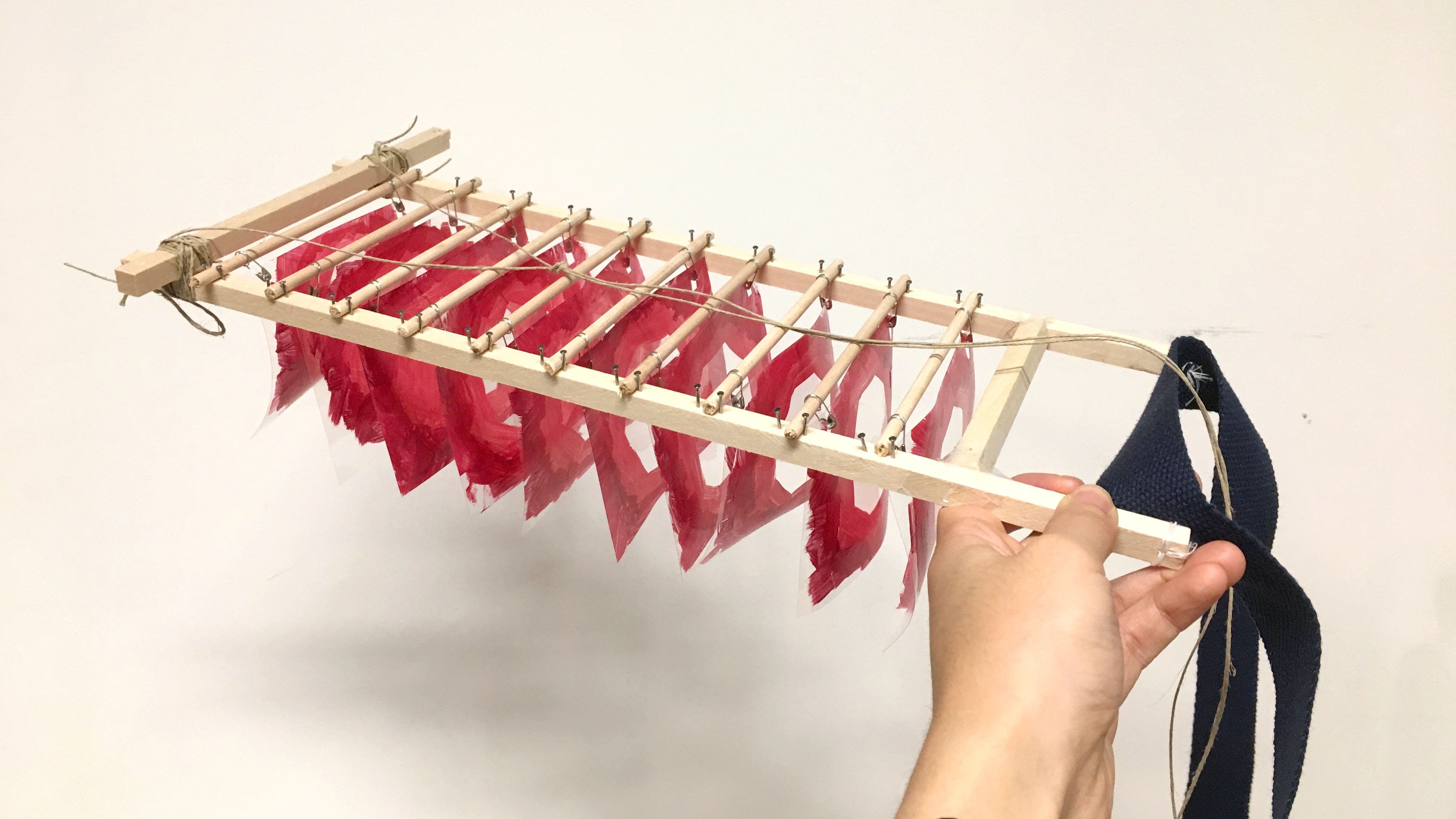
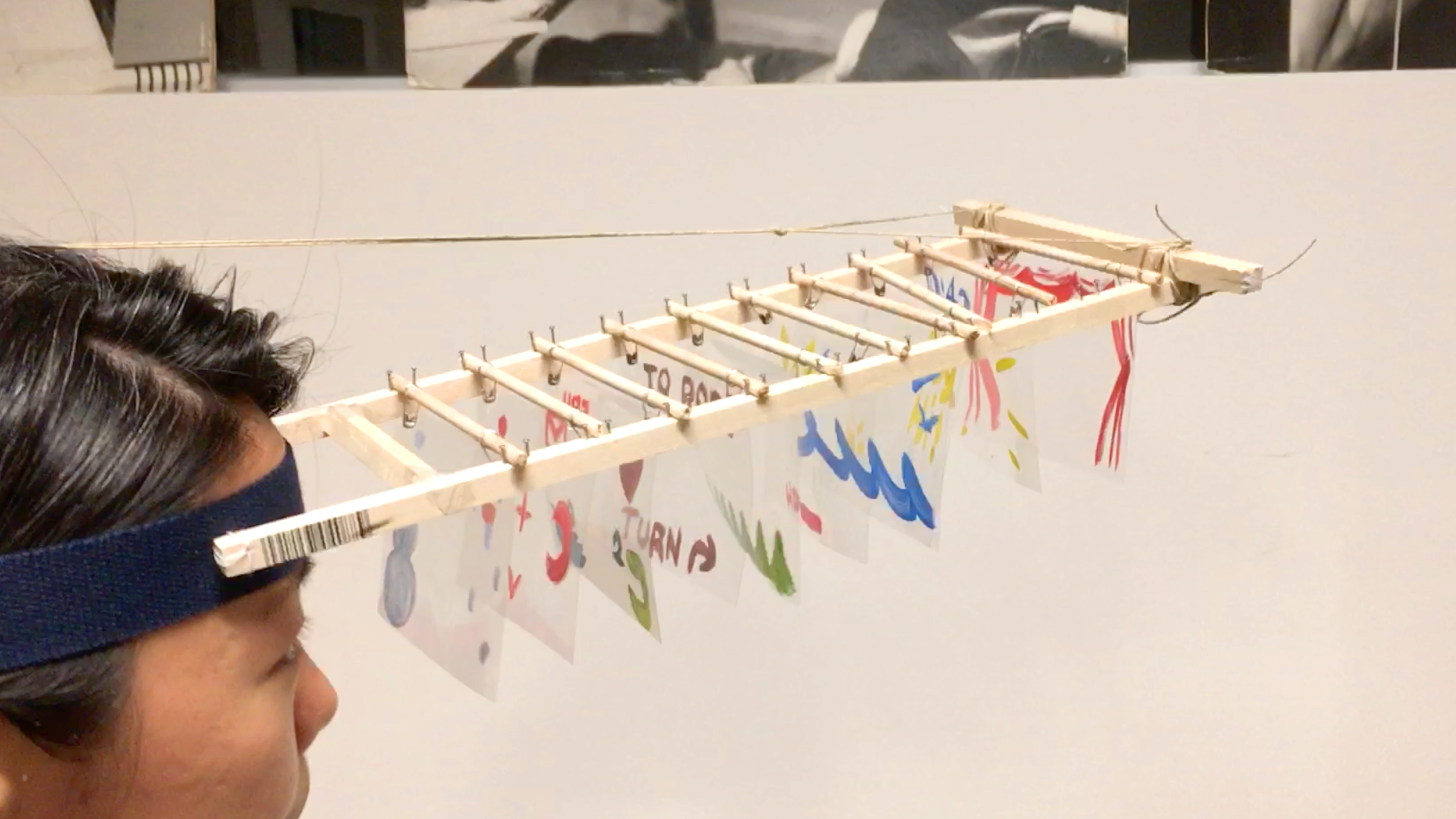
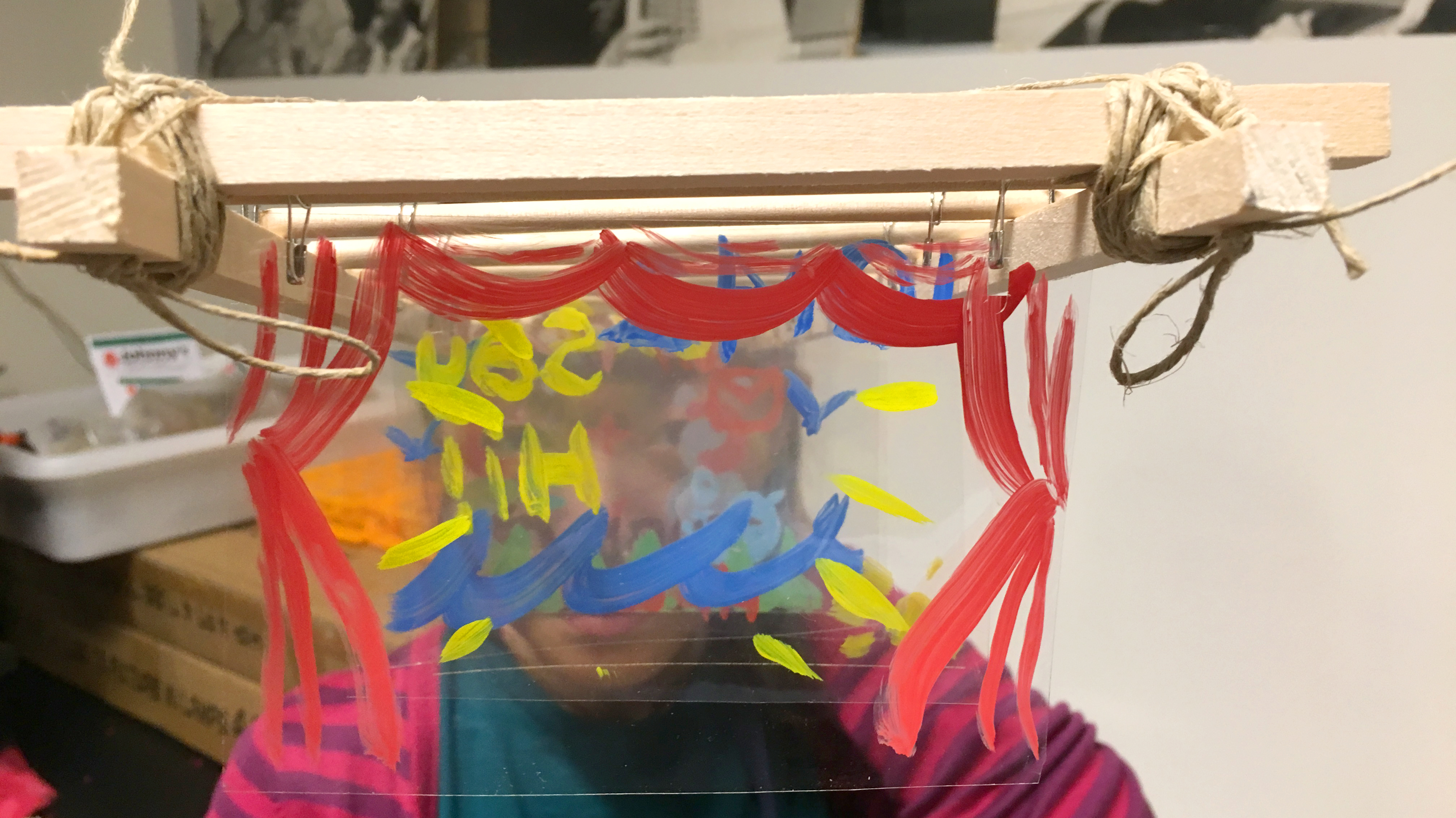
For STUPID SHIT NO ONE NEEDS & TERRIBLE IDEAS HACKATHON 2017, I made Peep Rack, a head-mounted display for you to see the world through intestine, a.k.a. sphincter. It’s analog AR, the combination of Peep Show box and cloth drying rack. Made of wood nails, fragile wood sticks, transparency films, strings, and acrylic paints.

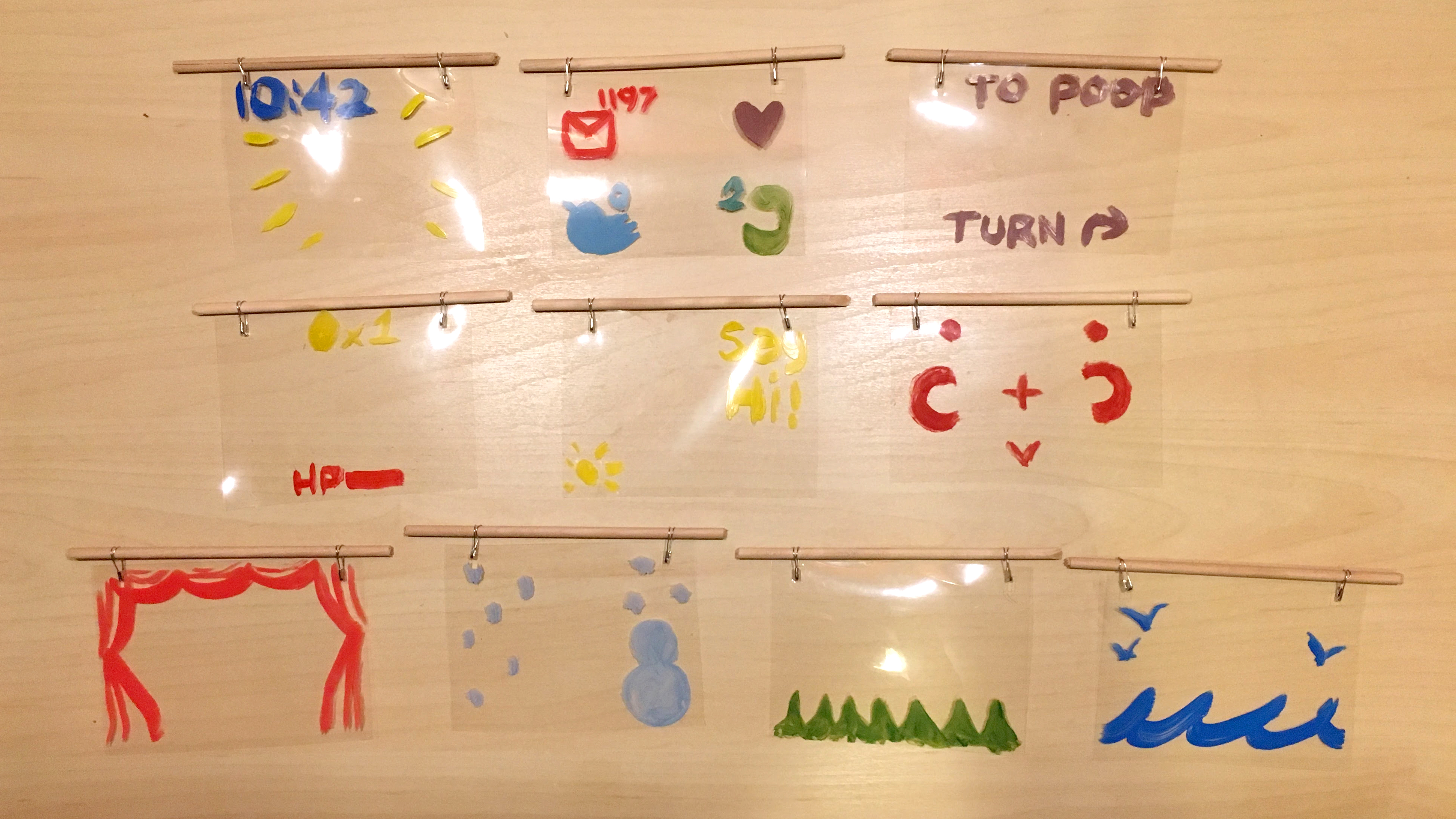
Because it’s transparency films, user can create whatever contents they want, and it’s sharable! Besides the sphincter, I also made a less practical one, containing different moods, scenarios, and functions.

<< clock, apps, map, life, reminder, target, curtain, snow, grass, ocean >>

5P Iteration_one

5P key values

  • daily based, multi user, interactions, physical

Iteration One

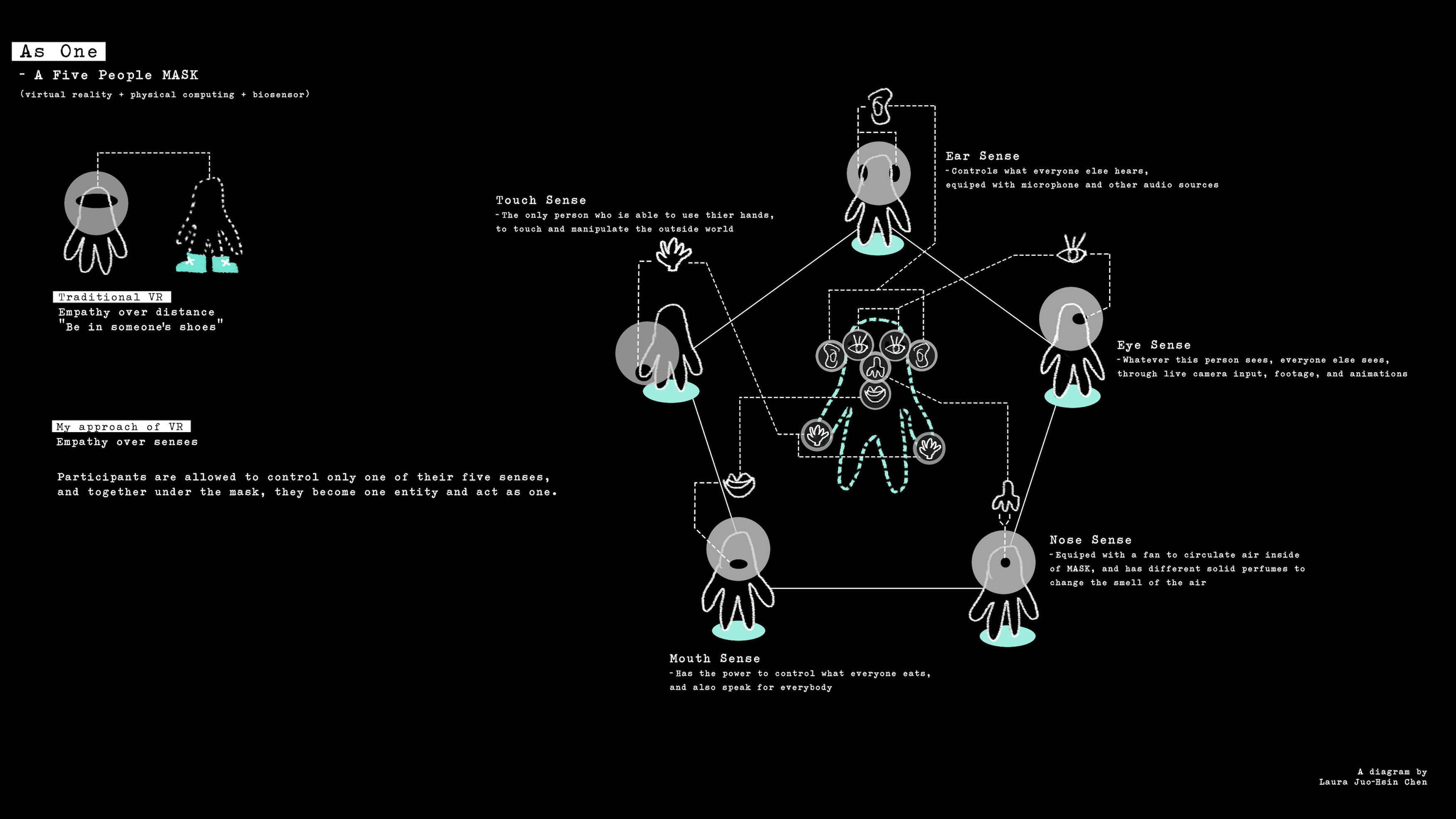
AS ONE

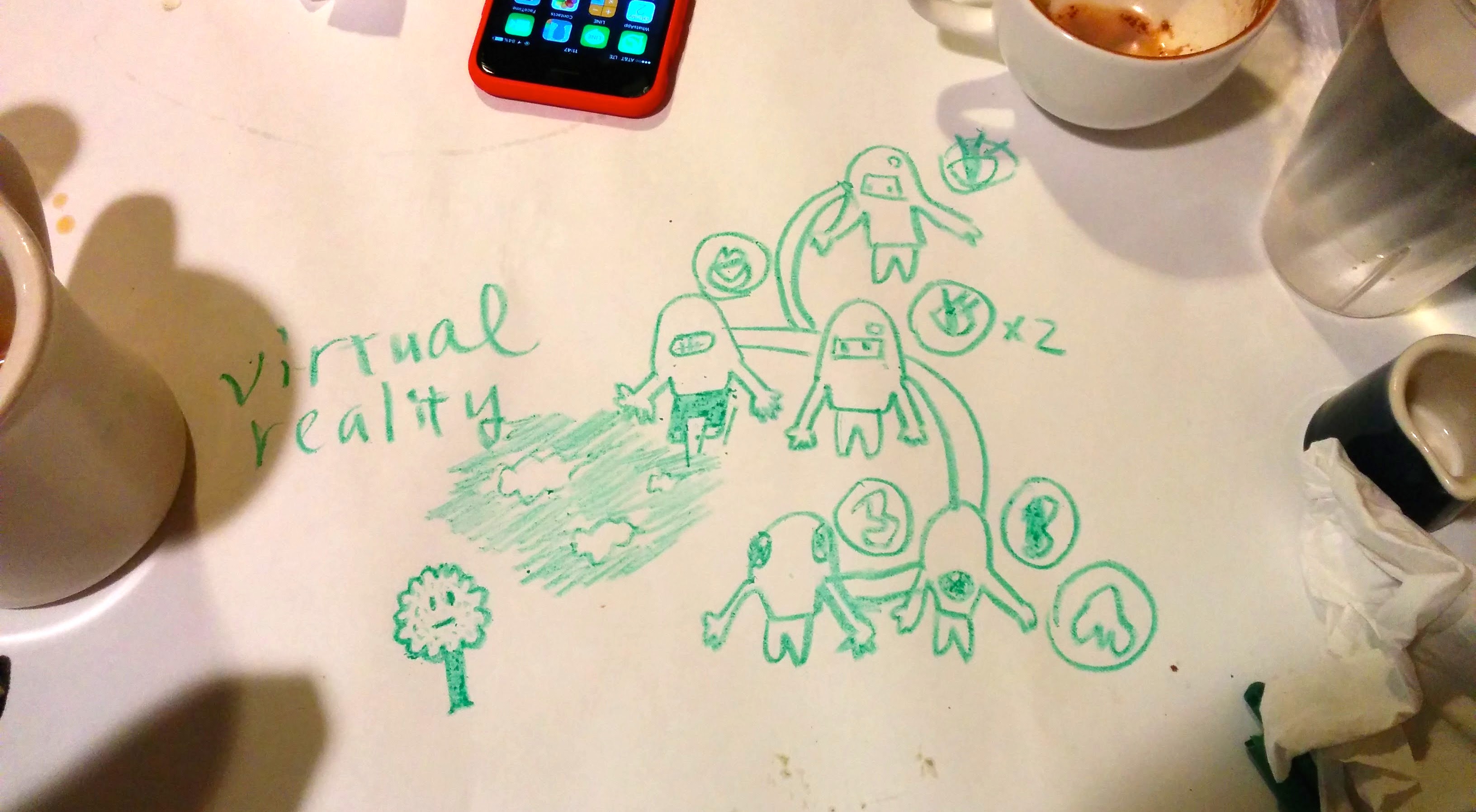
Users need to cooperate to live the life. Total 5 users: eye *2, nose * 1, mouth *1, ear *1.

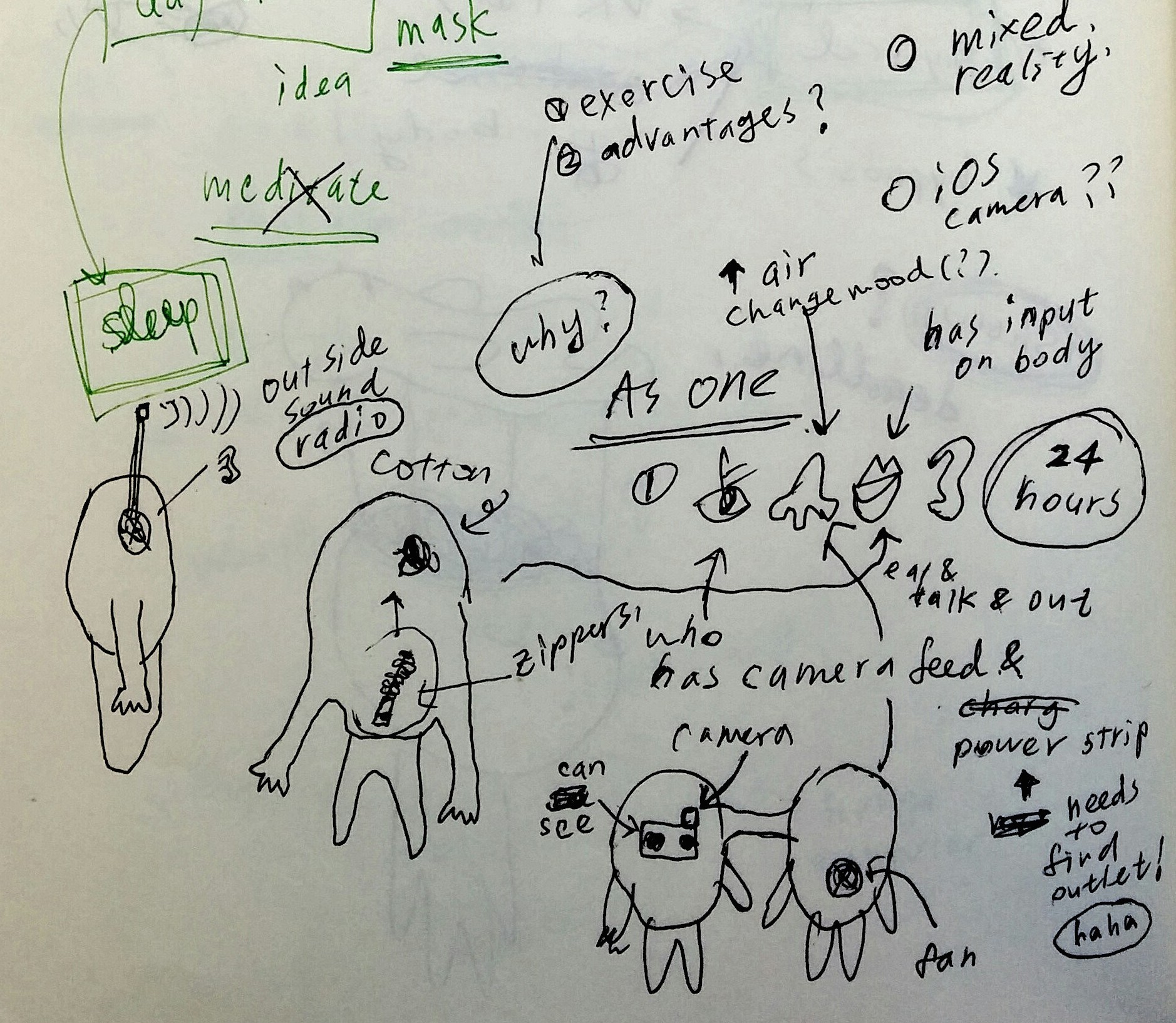
sketch

Test

All wear the masks, from waking up to going to bed. Camera follows the whole process.

Goal

Country doesn’t have all the resources, and the world operates by countries exchanging resources. This mask let users to experience this in an extreme way. After the experience, users will have unexplainable binding.

Features

ideas

Eye – able to see the world, and can use camera to pass down what he/she sees

Nose – has fan attached to the belly, provide air circulation and can change the smell of the air

Mouse – has opening to get food, and pass down what he/she gets

Ear – hear “outside sound” with radio and podcast


Button

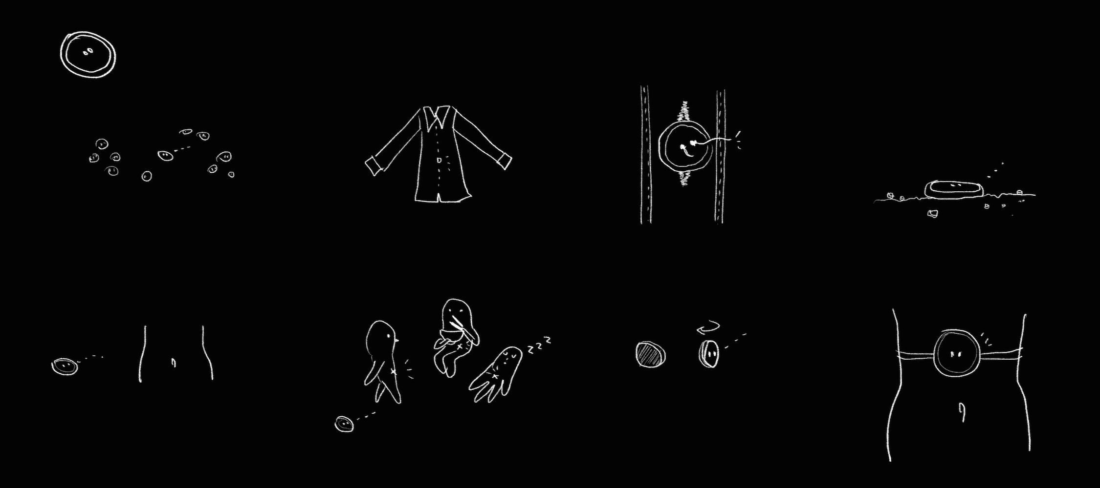
A button’s desire and personality.

button

And this is the sound that button wants to deliver. It wants to share what it hears, and thinks maybe the sound can comfort the soul of all the other buttons.

« Older Entries