Summer Throwback Two: Big Mac Index VR
In this summer, I was interning in The Economist Media Lab. It’s a tight team of Ron Diorio, Frank J. Andrejasich, and Ziv Schneider. The goal of this internship is exploring how The Economist can use virtual reality to enhance the editorial piece, reach broader audience, and create unusual experience.
Because of my previous 3D data visualization experiments, The Economist is interested how they can do data viz in VR, since data representation is one of their forte. Luckily, I could choose what I want to create, so I picked Big Mac Index. Why? Because it is BURGER dude. BURGER.
About Big Mac Index:
One of the most famous index of The Economist. The earliest data starts from September 1986, and it has been used as a semi-humorous illustration of purchasing power parity (PPP). It makes exchange-rate theory a bit more digestible.
For this, I use the every half a year data since 2000, and the countries include: Argentina, Australia, Brazil, Britain, Canada, Chile, China, Czech Republic, Denmark, Euro area, Hong Kong, Hungary, Indonesia, Japan, Malaysia, Mexico, New Zealand, Poland, Russia, Singapore, South Africa, South Korea, Sweden, Switzerland, Taiwan, Thailand, and United States.
There are total three scenes in this Big Mac Index VR: 1) Intro, 2) Map, 3) Comparison Mode.
INTRO
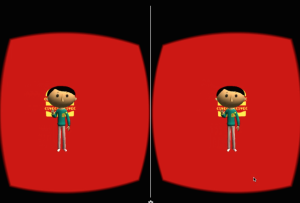
With bunch of graphics and little texts, the opening shows how to navigate and interact in the virtual world, and gives an intro about the Index. It’s like the traditional motion graphic voice-over video, yet it’s 3D and interactable.
MAP
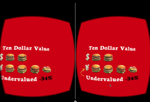
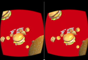
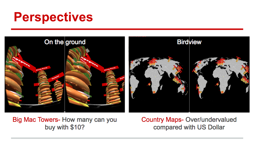
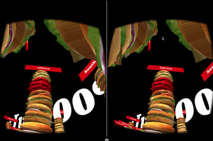
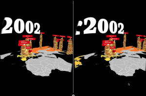
Map is the major part of Big Mac Index VR. There are two kinds of data: first one is “How many Big Mac you can buy with $10 value equivalent in the currency?”, second one is: “The valuation of the currency compared with US Dollar”. For each one, I use burger tower and color of map to represent it. Throughout different time periods, the height of the burger tower and the color of the map change.
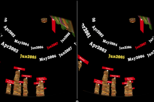
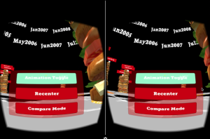
There are also two modes for how to display the data, one is automatic time passing by (default), another one is being designated. By tilting the headset 90 degree clockwise, the menu is toggled up to be chosen from. Once it’s not in auto mode, the time period appears in the sky for be chosen, and the map only shows data for specific year.
COMPARISON
Still in progress :) It’s for clear comparison in small group with selected countries.

